
Let me share a secret with you: good email design isn’t rocket science, but you do need fuel. Fuel to grab attention, keep interest, and direct users to that shiny CTA (call to action) button. A punchy headline, concise/intentional copy, appropriate colors, vibrant images, and a thoughtful CTA are the players that differentiate well-designed emails from ineffective ones.
That’s why the keen minds here at Fotomerchant want you to know what makes for good design and, equally important, to understand what designs work in your favor.
More on that later.
Getting good at good design
"Where do I start?"
Email service platforms have email templates with essential sections (header, footer, etc) already in place. Take advantage of these as a starting point, and fill in with your genius ideas. Paying close attention to the individual sections of your email design is pivotal to its effectiveness. So let’s talk about that.
Keep subject lines in line
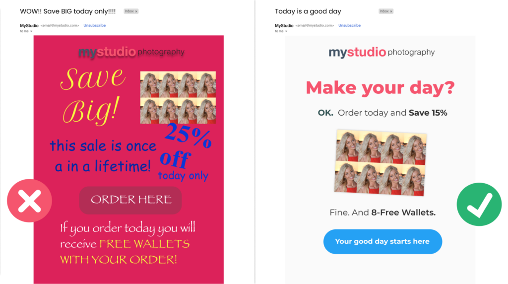
You want to compel readers, but avoid using all caps, exclamation marks, or overly salesy language because people DON’T LIKE BEING YELLED AT, nor feeling they’re being sold to. And that approach pushes nice emails to the spam folder. Instead, opt for a more personal, conversational approach with your subject line. Be authentic.
Hierarchy and headers
Keep the most essential info at the top, with headers that are larger/bolder than the body copy. Subheaders and bullet points make your email more easily scannable and the information less daunting. Your important messaging cannot resonate with an audience that hasn’t read it, so keeping the eye moving is key.
Keep it clean
White space, sometimes called negative space, is your friend. Too little white space between elements can make your design look crowded, busy, and unprofessional. Color choices should be informed primarily by your brand and have good contrast with the background. Avoid garish colors or choosing one just because you’re “in a purple mood!”
Most important to clean design are fonts that are easily legible. While getting creative with fonts is tempting, limit the flare (if you must) to a single headline. Please do not use Comic Sans or Papyrus for your body copy. That’s no good for anyone.
We all love buttons
It’s true, but if your design repelled or missed the call to action, your reader will move on without following through. A good CTA button uses action verbs to compel, legible text, has breathing room (‘oh, negative space!’), and contrasting colors for visibility. If your entire design is deep green, using a green button will make it hard to find.
Be consistent
Once your template is polished, save a copy for future use. Make rules and have whoever is creating emails follow them. Consistency of brand assets (e.g., logo size, color, fonts) communicates an organized, trustworthy brand, and we all like that.
The stellar design choices you’re now primed to make will keep readers interested and more likely to open the next email. Over time, you can implement the design choices that most effectively engage your target audience.
“Yes, but how can I know which design choices will help do that?”
That’s a great question; I’m glad you asked.

Track your design's impact
We love data
If you’re familiar with Fotomerchant, you know that already; we’re established industry leaders. Did you read The School Photography Industry Report?
Data is crucial, and making data-informed marketing decisions is transformational. If you don’t know which designs are working and which aren’t, you can’t adapt, and you can all but forget increasing engagement. We can track data to understand what promotions worked best, what day of the week to send (in 2023, Fotomerchant customers had the best conversion rates on Sundays), or what seasonal campaigns reaped the most rewards.
Split-test like a pro
You can optimize email performance over time by split-testing minor changes’ effectiveness and adjusting accordingly. You might track how a particular subject line performs, which promotion gets more clicks and orders, or it could be as simple as testing two differently colored CTA buttons. For instance, a recent breakdown of Abandoned Cart data revealed how a simple change in tone of voice led to 14% more clicks and conversions for one of our biggest studios. Small changes can be big!
Season carefully
Seasonal holidays provide important windows to market, but knowing which ones you don’t want to miss and which might underwhelm can be overwhelming! Instead, track your designs and unique promos over time (last year, Fotomerchant customers saw the most conversions with New Year’s and Halloween emails). You might discover that customers in your region respond better to Mother’s Day emails than Black Friday ones or that free shipping offers lead to more clicks than percentage-off discounts do!
We're always learning
And we love to share
Whether it’s data-fueled insights or how to optimize your workflow best, the Fotomerchant team wants to learn more, improve more, and help your business get Better and Faster. It’s not just a tagline and a great reason to use Fotomerchant.
If you’re a current customer looking to discuss split-testing or seasonal marketing campaigns, reach out to us on Slack. If you’re not yet on board, you should absolutely click the ‘book a demo’ button below to learn more. We won’t bite. Well, Peter might, he’s a part-time pirate.
Stay tuned for more on tracking data
Keep an eye out for Claudia’s informative follow-up to this blog. She’ll be taking a closer look at how Fotomerchant tests the frequency and timing of email delivery and how this testing can translate into more opens, clicks, and conversions for your studio.
“Well, I don’t want to miss that! I’m going to sign up for the newsletter right now.”
Hey, that’s a great idea. Scroll down to subscribe.