First impressions matter. When it comes to customer cart experience, we understand that less is more (unless ice cream is involved). The last thing you want is for a customer to become overwhelmed and leave the cart confused without making a purchase. Building your cart in a way that clearly communicates your products is not a one size fits all situation. Here at Fotomerchant, design your customer cart to work for your offerings. Don’t build a maze but rather a signposted road that leads all the way to the place order button. *insert cha-ching sound*
Let me show you! Keep reading to experience a generic example of how our customer cart format can look.
Cart Experience Walkthrough
Every good story needs a hero; enter Jack Largeman
BING! Jack’s parents just received a gallery notification email. Mum and Grandma received the email, and Grandma is eternally grateful that this studio entered her email as an additional one.
The simple but effective email links Jack’s Mum straight to her cart by clicking a button. This button will contain a direct link to Jack’s cart, so Mum doesn’t have to scramble through her mailbox or handbag to find that pesky access code.

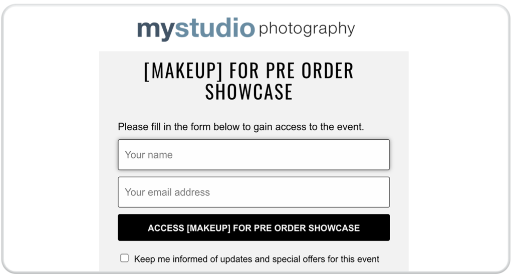
Once the button is clicked, Mum will first be shown an ID gate. This ID gate asks for the user name, email, and whether the customer wants to opt-in to additional marketing. Gathering the user email and name is essential as this information allows us to reference Mum’s name in future marketing. If she passes this link to anyone else in the family, we will also have their email address through the data collected at this ID gate. The opt-in checkbox allows customers to opt-out of marketing if they please, and they will receive no abandoned cart or promotional marketing in the future.
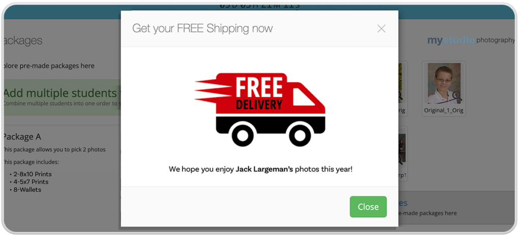
At this point, Mum is greeted with a pop-up. You can customize this pop-up with whatever graphic or text you would like. For example, notify your customers of any current promotions or important and relevant information like free shipping.
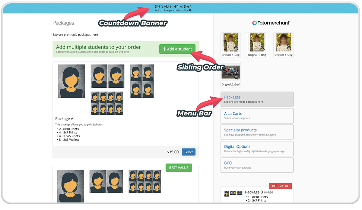
Once Mum enters the cart, create a customer-friendly experience by arranging your products and packages in a way that intrigues but doesn’t overwhelm your customer. We have many different customizable options that can be implemented to guide your customer through the cart.
See the below image to view our countdown banner, additional subject feature, promotional highlight, and menu bar. These three features are juicy blog posts in their own right and highly benefit your customer cart experience. To give you a high-level overview of our shopping cart, we will revisit these features in greater detail in future posts. For now, I want you to focus on the cart layout and how Mum can easily find her desired photograph of Jack through the screen’s handy menu bar on the right-hand side.
We have learned some tricks by tracking thousands of customers through their shopping carts. One to note is graphics matter. Outlining the products in your packages through simple bullet-point lists is effective, but nothing does the trick like visually seeing your prints. Provide a visual representation of what exists in your package through a complete graphic takeover, or a combo of a bullet-point list with accompanying graphic. Start out with our generic silhouette graphics, or provide your own. The sky’s the limit!
Scroll/swipe to see more examples of how your products can be presented in the cart:
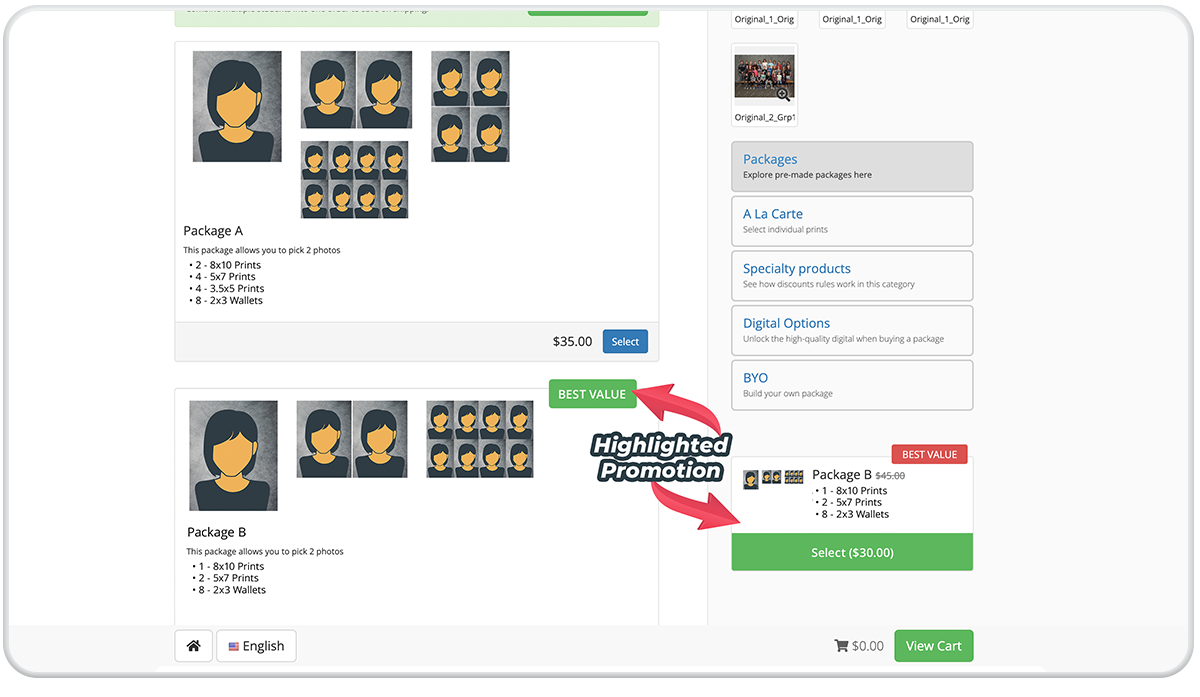
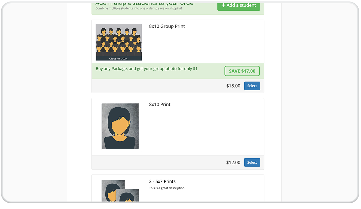
I could talk for days about how these shopping carts can differ depending on your studio needs. Everything from highlighting promotional products to graphics utilized, you can really make this cart your own. Rather than rambling on, why don’t I just show you how one of our studios has designed its cart! Swipe to view:
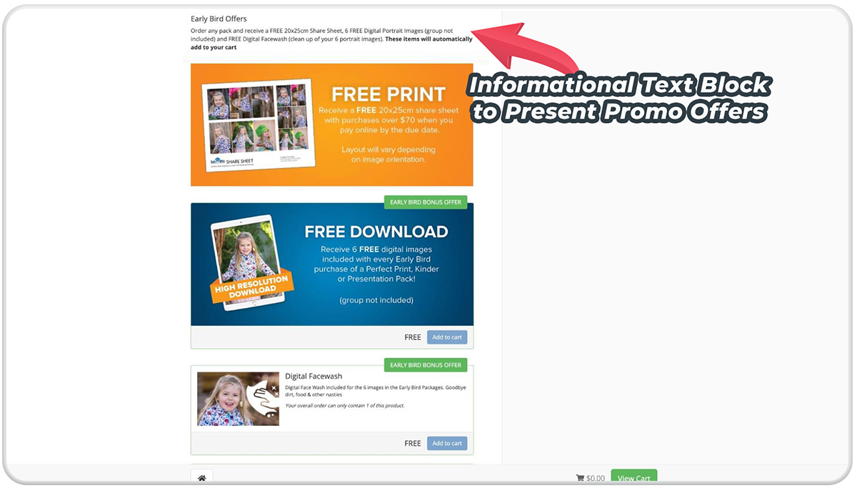
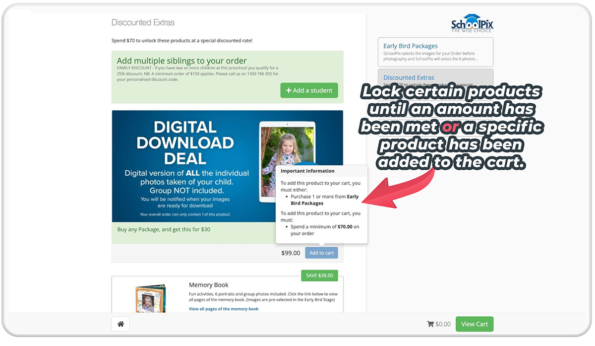
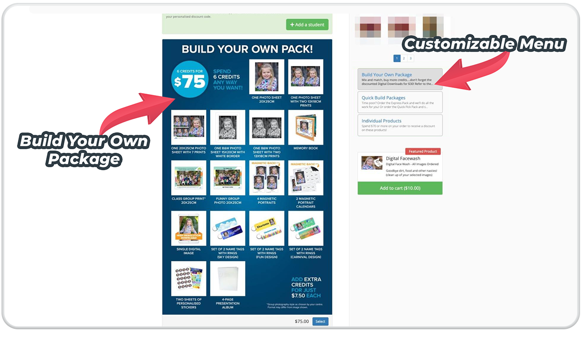
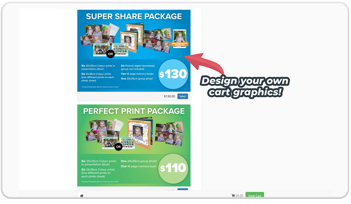
Well, there you have it. No studio is the same, so each shopping cart is different. We understand how other jobs may require alternate shopping cart layouts. At Fotomerchant, you can have multiple cart setups depending on your photography job. Build your cart in a way that works for you and your clients. Reach out if you want a demo tour and see this shiny shopping cart in action.


